Thriftbooks Case Study
A demonstration of research methods and design capabilities on the second-hand book selling platform.
Overview
The case study demonstrates UX/UI and Product design skills which are not represented the rest of my portfolio. I am a loyal customer and frequent user of Thriftbooks, both the desktop website and iOS app, which is why I've chosen their platform as the subject of this case study.
To inform my design recommendations I researched the company, competitors, and collected a small sample of customer feedback. Next, I analyzed a portion of their mobile platform using heuristic evaluation, a usability inspection method used to identify common user experience issues in a product's design. Based on findings from the aforementioned steps I made several design recommendations which would improve the Thriftbooks mobile application. Finally, I redesigned the screens analyzed in the heuristic evaluation to show what the Thriftbooks iOS app could look like following contemporary design conventions.
As of writing this case study, the Thriftbooks mobile app is on version 1.6.1 and was last updated in March, 2024
Company Profile
In order to provide more appropriate design recommendations I did a superficial pass over the company to find goals, mission, values, etc.
Brief
Thriftbooks was founded in 2003 and is the largest online seller of used books (citation).
Their value proposition to consumers is that they provide a large selection of affordable books with an accompanying loyalty program (citation).
The target audience is budget-conscious readers, book collectors, and students (citation)
A key differentiator from competitors is their ReadingRewards program which rewards members proportionately to the degree of their loyalty to the brand which is measured by amount of money spent per year.
Product
The Thriftbooks product is a multi-platform e-commerce application which is available on Web and mobile (iOS, Android).
Competitors
Amazon, Abebooks
Business Goals
Customer retention through rewards program
Competitive Analysis
I analyzed 3 of the most popular navigation apps on Apple CarPlay - looking both at the navigational hierarchy and UI components/patterns for inspiration.


Finding 1: UI Navigation
Apple provides a few options for UI navigation which were visible in the sample applications researched.
Finding 2: UI Components
Apple's design guidelines are very prescriptive and its limitations were helpful constraints when deciding which UI components to use and when.
Customer Feedback
For a general impression of feedback for Thriftbooks and it's mobile app I analyzed 60 reviews on Trustpilot (30 of the most recent positive and negative and 30 of the most recent negative reviews) and 60 on the iOS App Store (30 of the most recent positive and negative reviews and 30 of the most recent critical (negative) reviews). Reviews on Trustpilot were generally related to the company and product as a whole while the iOS App Store reviews were more specific to the mobile app. I chose to review these particular groupings of feedback (most recent positive and negative reviews + most recent negative reviews) to ensure there would be enough data for positive and negative patterns to emerge.
I started by reviewing customer feedback on trustpilot
30 recent positive and negative reviews
30 negative only reviews
App specific feedback on iOS
30 recent positive and negative reviews
30 critical (negative) reviews
30 recent reviews
30 negative reviews

App Store
30 recent reviews
30 negative reviews
All reviews were categorized by affinity and the following themes emerged:
Finding 1: Enthusiastic Customer Loyalty
Thriftbooks has a loyal customer base, myself included, which is evident from the majority of feedback that I reviewed.
Quote: “ThriftBooks books is an amazing website, I’ve bought so many good quality books from them over the years and I haven’t had any bad experiences honestly.”
Quote: “I like that I can find so many things on ThriftBooks that I cannot find in used bookstores. The selection is terrific and the prices are fair.”
Quote: "I have recommended Thrift Books to many people, which I do NOT do unless I trust them, which I do with Thrift. They say what they will do and they do what say. I have done business with THRIFT for over five years and I will be continuing for many more years."
Finding 2: Mixed Customer Service Experience
The customer experience (both positive and negative) was noted in a significant portion of reviews.
Quote: “Customer service was very helpful.”
Quote: “Customer service was very nice but you can’t trust how they list books.”
Finding 3: Recurring App Failures and Broken Functionality
Though most bugs and broken features are
Quote: “Customer service was very helpful.”
Quote: "Lately whenever I go to browse the app doesn't want to load. It just continually has the swirling loading icon.. it's been frustrating because I probably would have purchased items for Christmas gifts.. but the app won't work!"
Finding 4: Outdated App Design
Though most bugs and broken features are
Quote: “Unhelpful support, out-of-date interface, nonsensical cancellation policy. The website and the app both function like they're straight from 2009. Go to Barnes and Noble!"
Other Findings
Though most bugs and broken features are
Quote: “Unhelpful support, out-of-date interface, nonsensical cancellation policy. The website and the app both function like they're straight from 2009. Go to Barnes and Noble!"
Heuristic Evaluation
To assess the usability of the application I used Jakob Nielsen's 10 usability heuristics. My subject for this analysis was a common flow: finding a product and adding it to the cart.
Three of the ten heuristics produced notable observations which are detailed below:
Visibility of System Status
The Web and Mobile App do not appear to be following contemporary design system practices, so I created a rudimentary style guide to demonstrate my grasp of modern design conventions.
Issues
Currently active page could use better implementation
Recommendations
Consider bottom menu bar and page labels
User Control and Freedom
The Web and Mobile App do not appear to be following contemporary design system practices, so I created a rudimentary style guide to demonstrate my grasp of modern design conventions.
Issues
Back button not available. Swipe gesture non-functional.
Recommendations
Add a back arrow icon button to allow users to return to previous steps in their flow
Consistency and Standards
The Web and Mobile App do not appear to be following contemporary design system practices, so I created a rudimentary style guide to demonstrate my grasp of modern design conventions.
Issues
Star icon used for “Profile Overview” page in topnav then in the sidebar it’s used for “My Thriftbooks Account” page
in the accounts page the star icon is located in a group with Points balance, so in total the user has three semantic connections for one icon
Recommendations
By today’s standards, a star icon is typically reserved for “Favoriting” items
Allow user to choose profile picture
Use the User icon that I saw in previous screenshot
Style Guide
The Web and Mobile App do not appear to be following contemporary design system practices, so I created a rudimentary style guide to demonstrate my grasp of modern design conventions.
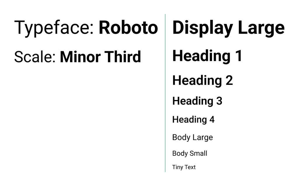
Typography
App does not appear to be following a type scale. Picked a Minor Third scale because good for information dense applications. Roboto font selected for versatility with weights and
Color
I documented Thriftbooks current color system and added to it. Two primary brand colors: green and purple. The neutral gray base, from what I can tell by inspecting the css of the site, is not part of an organized palette. Secondary colors can be found in branding material from ReadingRewards page. I took all found colors and ran them through the tailwindCSS color generator to create color palettes. The secondary colors are vibrant and saturated, so I added a bright teal and orange to round out the secondary accent colors available.
Spatial System
4 Pixel grid
Recommendations
The following are product and UX/UI recommendations informed by Thriftbooks' company profile, customer feedback, heuristic evaluation, and my experience as a frequent user.
Dark Mode
During competitive analysis, I noted that the dark mode present in Apple's Books app was especially pleasing for night time usage.
Increase Visibility of Support Channels
To assess the usability of the application I used Jakob Nielsen's 10 usability heuristics. Numbers 1,2,3 were omitted as no issues were found
Issues
Apple's design guidelines are very prescriptive and its limitations were helpful constraints when deciding which UI components to use and when.
Recommendations
Apple's design guidelines are very prescriptive and its limitations were helpful constraints when deciding which UI components to use and when.
Intercept Negative Feedback
To assess the usability of the application I used Jakob Nielsen's 10 usability heuristics. Numbers 1,2,3 were omitted as no issues were found
Issues
Apple's design guidelines are very prescriptive and its limitations were helpful constraints when deciding which UI components to use and when.
Recommendations
Apple's design guidelines are very prescriptive and its limitations were helpful constraints when deciding which UI components to use and when.
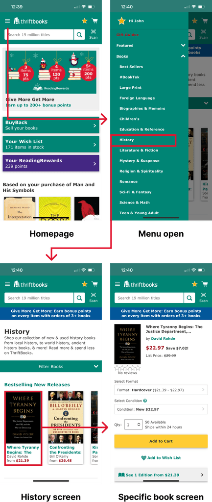
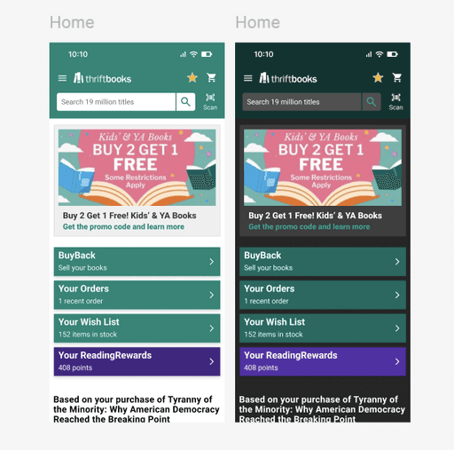
Screen Redesigns
The Web and Mobile App do not appear to be following contemporary design system practices, so I created a rudimentary style guide to demonstrate my grasp of modern design conventions.
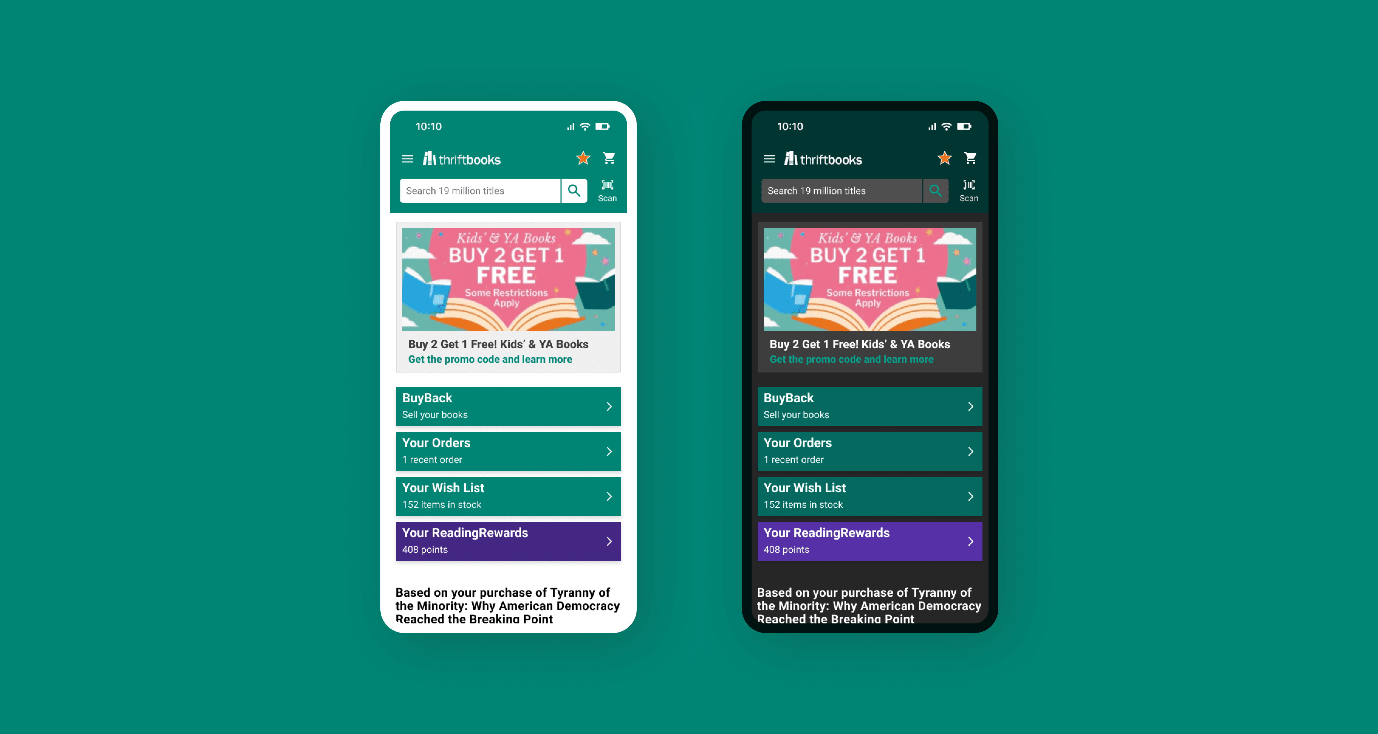
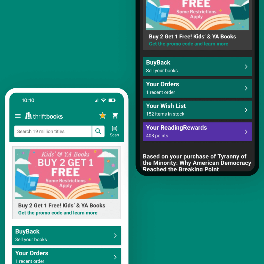
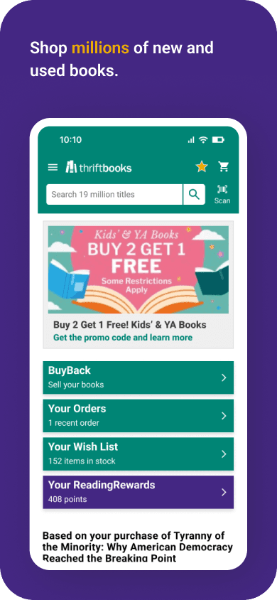
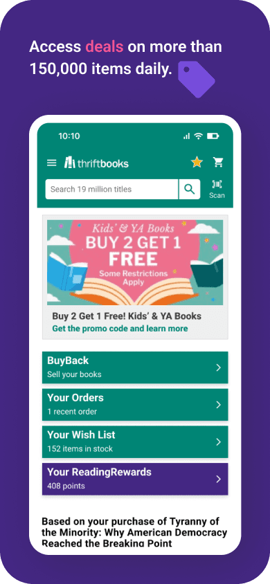
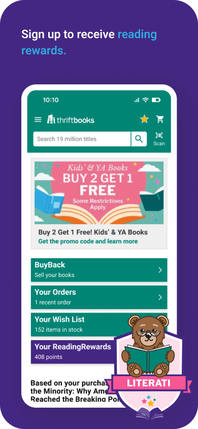
Home page
App does not appear to be following a type scale. Picked a Minor Third scale because good for information dense applications. Roboto font selected for versatility with weights and
Current

New
Listing Detail page
I documented Thriftbooks current color system and added to it. Two primary brand colors: green and purple. The neutral gray base, from what I can tell by inspecting the css of the site, is not part of an organized palette. Secondary colors can be found in branding material from ReadingRewards page. I took all found colors and ran them through the tailwindCSS color generator to create color palettes. The secondary colors are vibrant and saturated, so I added a bright teal and orange to round out the secondary accent colors available.
Deals page
4 Pixel grid
Reading Rewards page
4 Pixel grid
Project Summary
During the project, I managed to evaluate the market, create low fidelity wireframes, and connect them into a prototype at a higher fidelity. My designs went through several iterations before they were developed and WolfPack for Apple CarPlay was launched in July 2022.

